

FLO
SITE REDESIGN & BRAND DEVELOPMENT
2020

How do we make the homepage a place where we can convey what the product is, what it does, and create a level of trust with customers?
FLO is a natural gummy vitamin that helps women feel their best during their periods by eliminating menstrual pain. Their mission is to promote self care by encouraging their customers to take small acts everyday for themselves. With an improved user experience, answer first approach, and a clear story line, FLO hoped their customers would either buy the product or learn more about it.
My task was to do a complete redesign of their website that is mobile first, and customer centric. Their business goals were to increase conversions and also build a returning user base. Our user goals were to simplify the shopping experience and help customers understand the benefits of the product and its proof of success. Additionally, the redesign was also meant to serve as a strong foundation for future testing and optimization.
To achieve the goals, we wanted to evoke a strong sense of maturity and trust with the site. At the same time, FLO didn’t want to come off as too serious, and wanted to remain current and fun. I developed a simpler aesthetic and incorporated a minimalist conversion pathway. With these improvements, we hoped to ultimately become a key part in young women’s self-care routines.


Trust Us
A huge piece of the puzzle was to really nail what the founders wanted to say to their users. FLO wanted to capture this in a more unique, scrolling story type format. The crux of FLO’s story I knew was going to come through on the homepage. I ended up extracting that information in meetings with various exercises. We discussed user assumptions, created user personas and detailed out some known customer behavior that ultimately led to us figuring out what cadence felt right to tell FLO’s story. I also did empathy mapping and storyboarding to get the client into the customer’s shoes and really find out what they were unsure or afraid of.
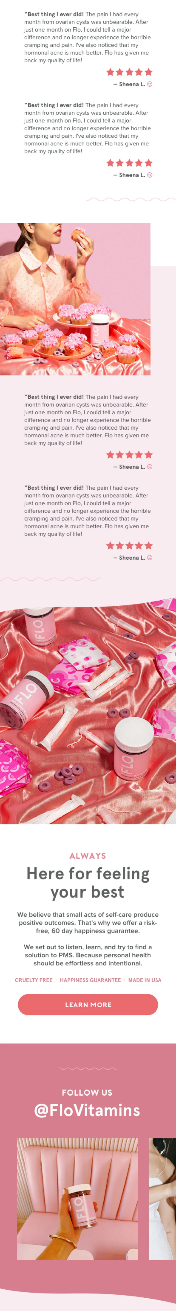
FLO’s previous website was immature and didn’t feel like it had a strong scientific backing. We discovered through these exercises that the lack of seriousness created a lot of questions for potential customers. At the end of the day, women are putting this vitamin into their bodies, so we really wanted to lean on education and science more with the redesign. In order to do this, we added an interactive ingredients list and also gave some more proof that it worked. I incorporated press logos and added a large, engaging review section in the homepage.
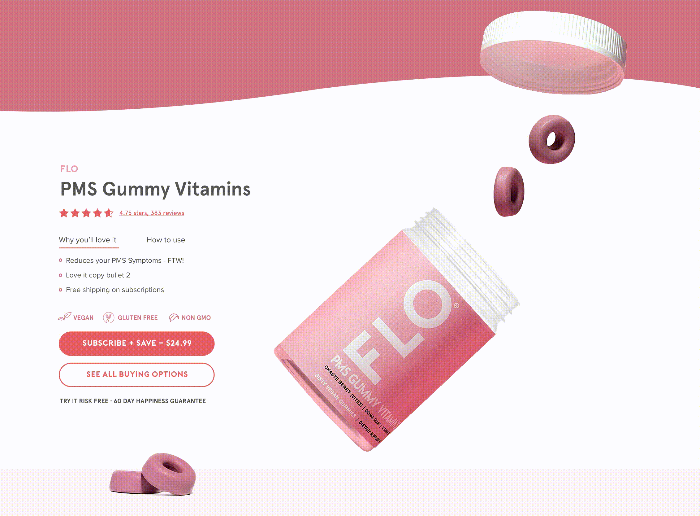
There are also a lot of varied results from the vitamin itself because everyone’s bodies are different. The previous website wasn’t clear about what symptoms they could expect to see cleared up by taking FLO. I put that front and center under the homepage banner so it was very obvious about what this vitamin treats. This vitamin in particular takes at least two weeks to start to show symptom improvement. In order to convey this, I chose to add this information to the homepage so the expectation was really clear up-front that it works differently than other supplements. I developed a “What To Expect” timeline that helped set the tone of when a woman should expect to see improvements with her pain she’s experiencing.


Make it POP
To infuse more fun elements into the brand and into the website, I added various animations throughout the homepage. The squishy looking “O” of the vitamin was begging for some bouncing and movement. I incorporated a stacking gif of the vitamins near the ingredients to get users to pause on that area and interact with the ingredient accordion. Next, I kept the shopping flow super simple here, by adding a “mini-PDP” element to the homepage where the user could add right to cart or start their subscription immediately. To catch their eye, I separated the lid, the vitamin and the bottle and created a “falling” (parallax) effect. Prior the the reviews section, as you scroll, the vitamin actually rolls down the page. If a user scrolled back up, so did the vitamin. These little, fun elements incorporated in the site keeps users engaged and encourages them to keep scrolling down the page.
We unfortunately didn’t move past the homepage for this particular project, but my hope would be to build out the Product Detail Page and continue the simple purchase flow through cart and through the checkout experience. The goal was to keep it light and snappy, yet feel trustworthy enough to build that customer confidence to actually press “buy now”.


My Role
DESIGN
UI/UX Product Design, Wireframes, Information Architecture, Creative Direction
OTHER